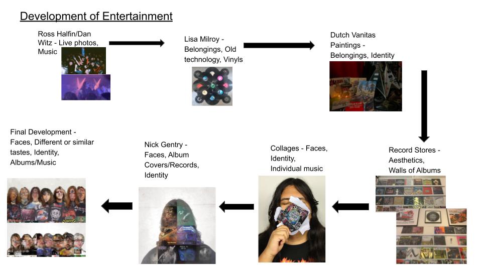
Entertainment
As it was hard to pick between the two titles, I decided to experiment using both titles 'Entertainment' and 'Old Technologies' to see what would work best, in the end I chose entertainment, as it was better for me to explore through
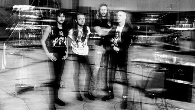
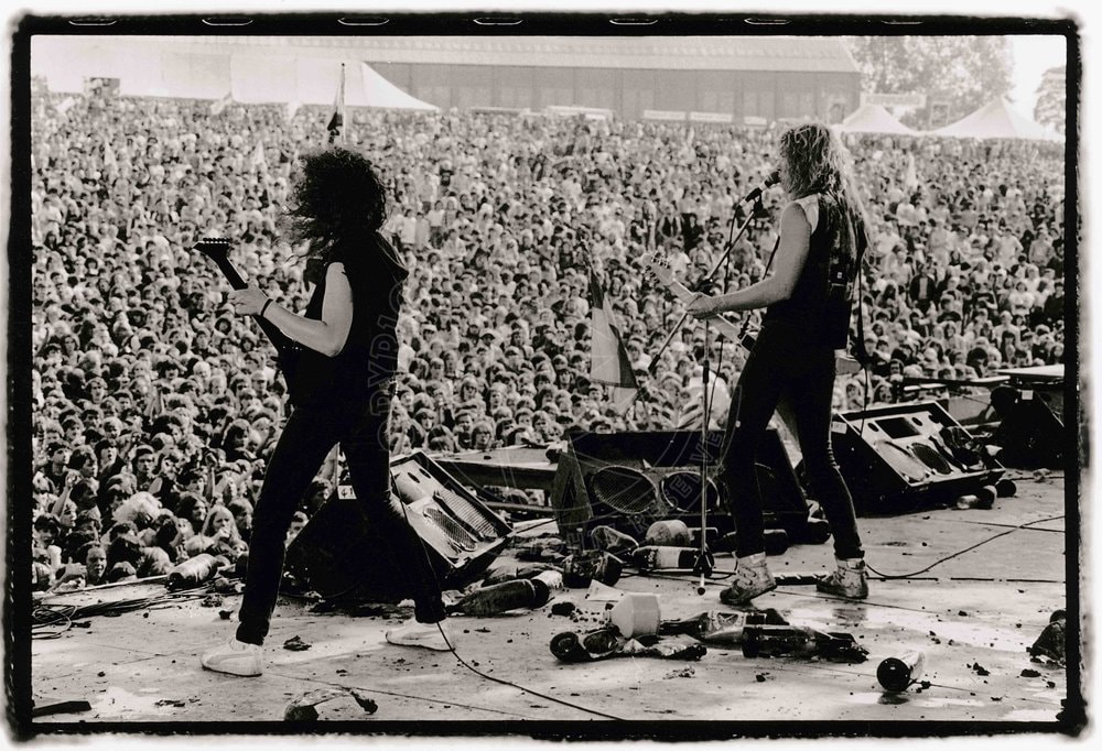
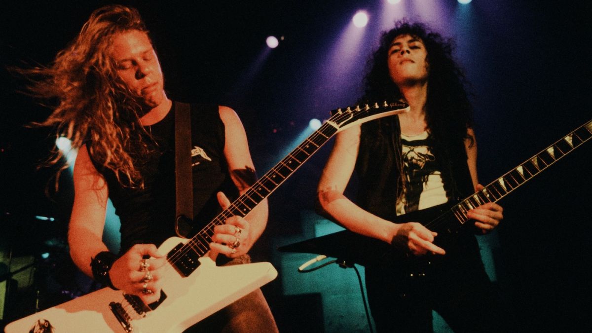
Ross Halfin
Ross Halfin is a famous British photographer best known for taking pictures mainly of famous rock bands since the late 1970s. Some of the notorious bands he worked with include: Metallica, Motörhead, W.A.S.P. and Iron Maiden. I decided to use him as an influence for Entertainment and I am very involved with the music scene of heavy metal and I wanted to capture what the culture is like.


|
|

|
My Response:


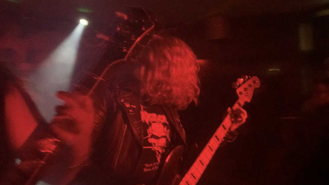


I feel like this went very well. The blurry quality makes this look very authentic like similar photos from the 1980s heavy metal scene. I especially like the crowd photos as the look is very similar to the Mosh Pit paintings by Dan Witz
Lisa Milroy
Lisa Milroy is a Canadian artist known for her still life paintings of everyday objects. In the 1980s Milroy's paintings featured ordinary objects depicted against an off-white background.


My Response:


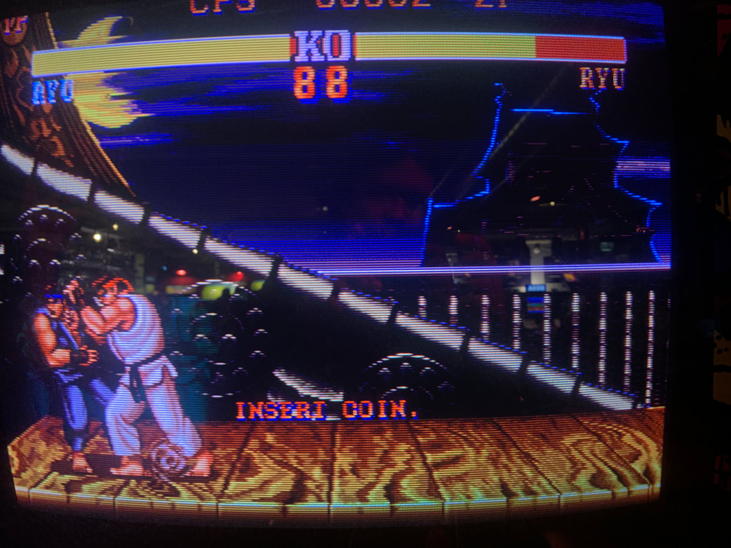


I feel like the response worked although I could have tried experimenting more with organizing the records and composed better with a less aggressive light, I could have experimented more with the Sega games as I could have had bigger better ideas. I also tried to capture the CRT monitors which worked well as you could see the lines and the blur feels very authentic though there are still some reflections showing through.
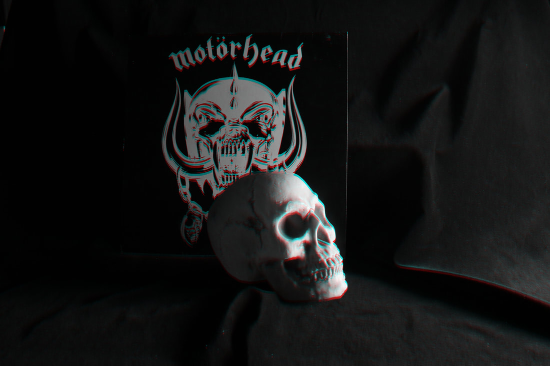
Dutch Vanitas Paintings
Vanitas was a popular Dutch art genre of the Baroque period. It showed everyday items to represent someone's personality and who they were while always containing a skull to represent mortality.


I'm very happy with the outcome of this project, it was very successful capturing the same essence as the original paintings. I tried different ISOs and was happy with the darker images which fit the Vanitas style.
Exhibition: Chris Killip - Retrospective
The exhibition I visited was at The Photographers Gallery in Soho. This was an exhibition about the works of Chris Killip and how his photos during the 1970s and 80s explored the issues of people being affected by economic shifts particularly in the North of England. Many of his photos tell different stories of the people that lived in and around those villages. My personal favourite section was the pictures of the group of punk teenage boys who befriended them and showed him around. It was quite sad reading about how most of them died in a boat accident. There was also some great documentation about how the social issues of that time helped create the British Hardcore Punk scene during the early 80s.


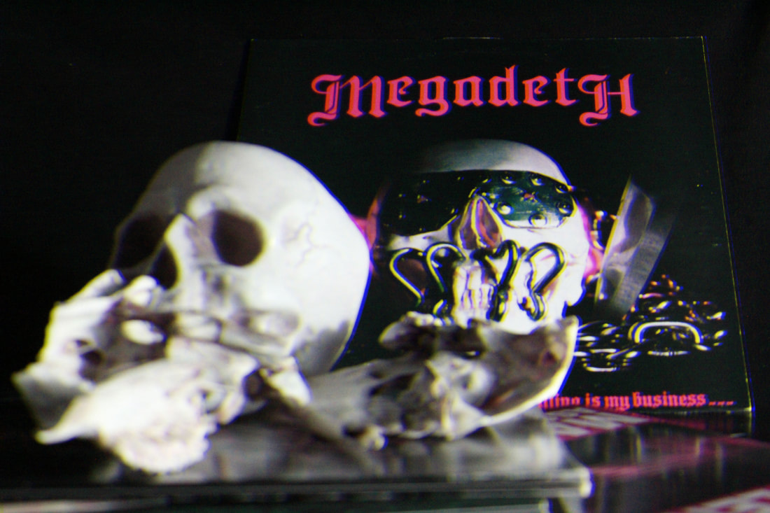
Development 1: Vanitas
I decided to try experiment more with the vanitas paintings and used some of my heavy metal vinyl records I own and tried to make some dramatic and dark pictures with the different record. I used album covers with skulls and fantasy imagery (Like Mercyful Fate, Cirith Ungol, etc.) which worked very well.


I also used photoshop to make a 3d effect and give it vintage horror movie look which worked really well.
|
|
Although it's drifting away slightly from the main point of the project, I felt that these came out very successfully. I especially like how the skulls are blending in with some of the album covers almost making another cover or extending it.
Movement 2: Record Shops
I decided to try see if I could develop ideas with interesting places that sell music. I decided to try capture the atmosphere and the eerie vintage horror inspired interior of one of my local record stores. I feel like a few pictures represented the place relatively well though it was quite hard to take picture of some of the walls as some of the light from outside was reflecting on the sleeve protectors so it was quite hard to take clear photos of some walls of albums and I feel like the composition could be a bit better.


Movement 3: Basic Collages
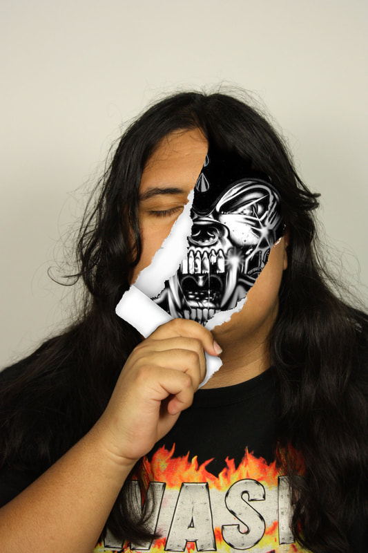
I started to think more about people's identity represented by music and got the idea of printing different bands and albums out, ripping them apart and making a collage of different album covers of bands I liked and used photoshop to edit a photo of myself ripping off my face to show my music taste inside.


Original Pictures


Edits:
I used different PNGs of ripping effects onto photoshop and used shadow effects and layering to give the effect of ripping my face off.

|
|
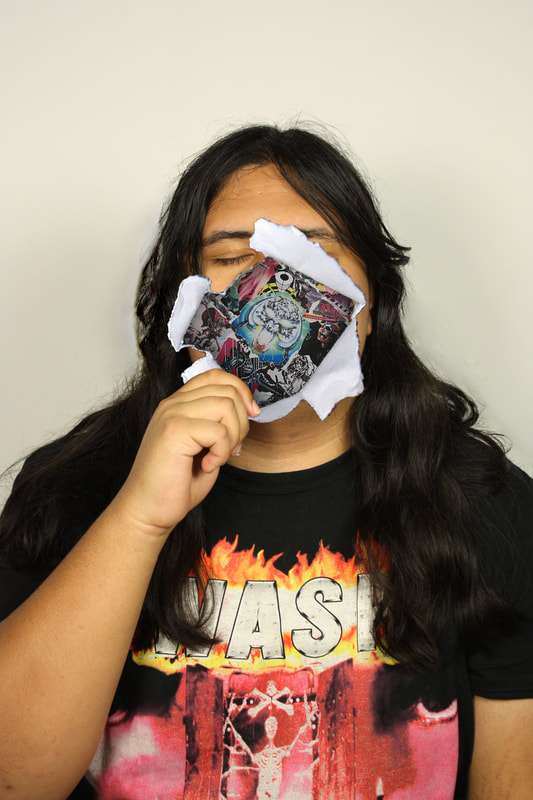
I'm quite happy with how these edits came out. Though I feel like I could have blended the effects together a bit more. I especially like the one where I rip off my face to reveal Snaggletooth, the mascot/logo for Motörhead, as if the beast is taking off its disguise.
Development 4: People's Favourite Album Collages/Nick Gentry
For my next development I decided to try take pictures of different people and make a collage of their favourite albums and putting them together showing everyones different identity and taste. I was inspired by the works of Nick Gentry. He is well known for his art from making a collage of vinyl sleeves and records and painting silhouettes of people with small details of their face.


My Response:
I took photos of different friends of mine and used photoshop to make a 4x4 grid of my friends' favourite albums. Then I made a plain white background with a cut out of their silhouettes and I used the eraser to rub out most of the faces to show the albums behind while still leaving facial features and details.
I felt these came out very well, though I feel like I could maybe put a vintage worn filter as I think it looks a bit too clean.
I felt these came out very well, though I feel like I could maybe put a vintage worn filter as I think it looks a bit too clean.
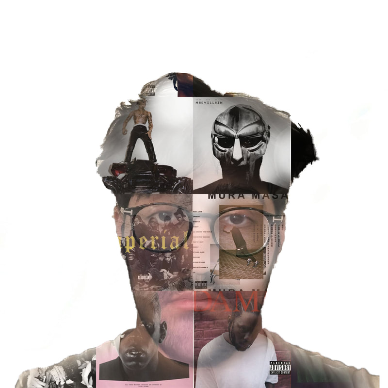


Updated edits: I'm very happy with how they look now, it's more full of life and gives off a vintage look as if they represent old records.
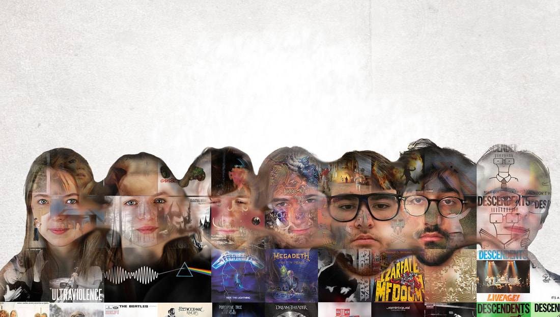
Final Piece - Face/Body Merge
For my final piece I took the idea of Nick Gentry and tried to see what happens when I merged the different people together and put everyone's different albums all in one to show how different each of the columns of albums are different to the others. I took some new photos of some people from my class.
I made a long grid to put everyone's favourite albums combined and put different sections for each person. I put a white background then took the original photos with some new people as well and used the same method as the individual images except I used the smudge and eraser tool to marge the faces together.
I made a long grid to put everyone's favourite albums combined and put different sections for each person. I put a white background then took the original photos with some new people as well and used the same method as the individual images except I used the smudge and eraser tool to marge the faces together.
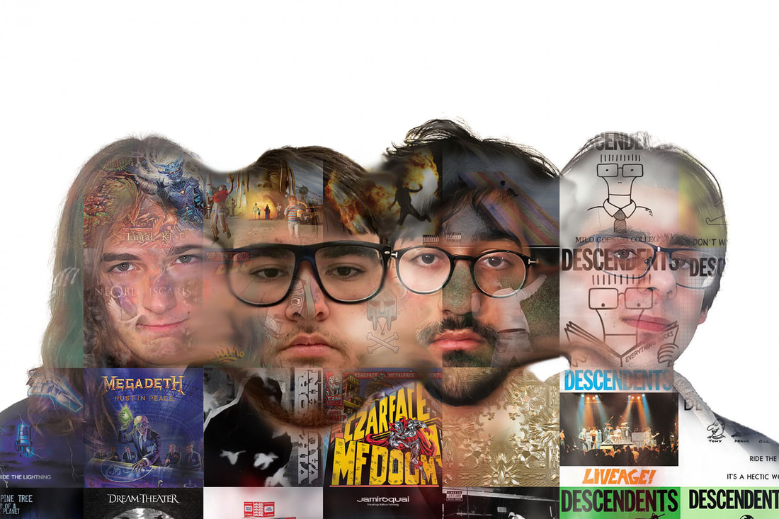
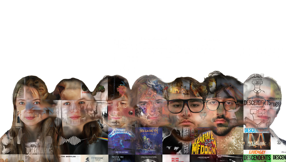
I also tried using the vintage filter to make it more interesting and I think it really works with the weird abstract nature of the image.
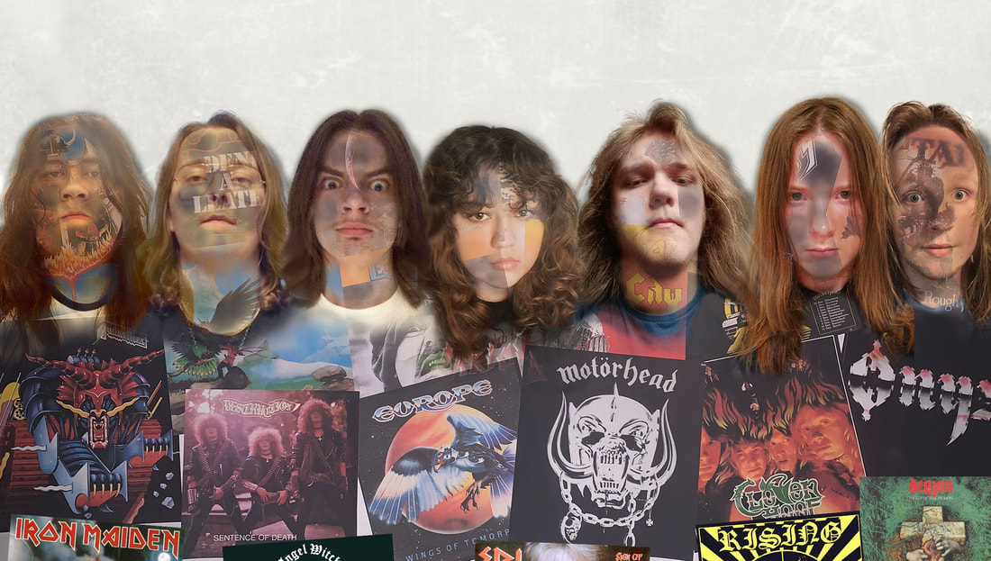
I also tried taking pictures of my other friends who are part of the hardrocker group to show different people who do have similar music taste. I cut out different albums that mean a lot to us and made in into a collage on a white piece of card. I then did the exact method as the previous images without merging faces but the bodies instead as we all have long hair and it would ruin the image.
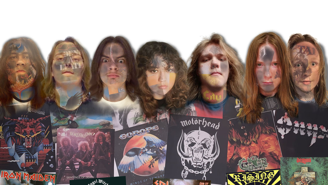
I was happy with the results but I feel like I could have tidied up the shadows which I did later for the final print.
I also tried making a vintage filter variant which works as most of these album are around 40-45 years old by now.
I also tried making a vintage filter variant which works as most of these album are around 40-45 years old by now.
Overall I'm very happy with the outcome of the final piece. The only thing I would try fix is the shadows and the merging of the shirts/clothes but it turned out very well I think.